Introduction to UberMenu – WordPress Mega Menu Plugin
| Plugin: | UberMenu - WordPress Mega Menu Plugin |
| Plugin by: | Chris Mavricos, SevenSpark |
| Website: | sevenspark.com |
| Created: | January 20, 2012 |
| Guide Last Updated: | April 9, 2013 |
Welcome to UberMenu! Thank you for purchasing this plugin, I appreciate it!
This guide should answer all your questions about how to use this plugin. You can browse the document using the navigation sidebar on the left, or search the entire document by using CTRL+F in your browser.
The latest version of this support guide can always be found here: UberMenu Support Guide.
Video Tutorials
Here's a playlist of UberMenu Video tutorials.
You should still read the guide! The videos are supplementary, not replacements :)
Getting Support
Please be polite when requesting support, and I'll be sure to respond as soon as possible. I'll do my best to answer your questions, but unfortunately I generally can't offer customizations beyond a few lines of code - there just aren't enought hours in the day! Of course, I will always provide fixes for any bugs that crop up as soon as can be :)
Requirements
There are several requirements for use of UberMenu
- WordPress 3.3+
- Use of the WordPress 3 Menu System
This can be accessed through the Control Panel of any WordPress 3 install via Appearance > Menus - A WordPress 3 Menu System-Compatible Theme
The WordPress theme you use must properly implement WordPress 3 Navigation Menus. That means using the standardwp_nav_menu()with a registeredtheme_location.
Is my theme compatible?
wp_nav_menu with the theme_location parameter. If you don't know
how to check the code of your theme, just follow the instructions below.Your theme must properly implement the WordPress 3 Custom Menu System in order to support WordPress out of the box (note that you can still use UberMenu without a properly supported theme, but you'll need to add some PHP). To check if your theme supports WP3 Menus:
- Log into the WordPress Admin area.
- Navigate to Appearance > Menus. If this option is not available, WP3 Menus are not supported.
- In the Menus panel, look at the Theme Locations meta box. It will tell you if your theme supports WP3 Menus.
Note: Please check if your theme has Specific Integration Instructions
Theme Supports WordPress 3 Menus ↓ |
Theme Does NOT Support WordPress 3 Menus ↓ |
|
Appearance > Menus > Theme Locations: Your theme supports 1 menu. Select which menu you would like to use. |
Appearance > Menus > Theme Locations: Your theme supports 0 menus. |
WordPress 3.5

|
WordPress 3.5

|
|
UberMenu can apply to this menu automatically
|
UberMenu can't automatically apply. You need UberMenu Easy Integration
Previous versions may look like this: 
|
Known Exceptions:
-
Artisteer does not call
wp_nav_menu, so it does not support UberMenu out of the box. You'll need to use UberMenu Easy Integration with Artisteer. -
Headway 3.x now uses WordPress 3 Menus, but to remove the residual styling you'll want to use these special instructions.
Headway 2.x does not support theme locations, so you'll need to follow special instructions to set it up if you want to use multiple menus: How to integrate Headway. Given the non-standard way Headway is implemented, I do not recommend using UberMenu with Headway unless you are very comfortable with adding custom code to your site.Update: As of Headway version 2.0.11, I am informed that Headway now uses the standard WordPress Menu System, so it should now be much easier to integrate!← I have received conflicting reports regarding current compatibility, so I am reverting this to "not supported out of the box". If you don't see the Theme Locations box pictured above in your Appearance > Menus screen, you'll need to follow the Headway integration instructions. - Suffusion implements a non-standard menu. However, at the last version I tested, the menu can be easily replaced with UberMenu via these integration instructions. I do not recommend use with this theme unless you are comfortable adding a small amount of PHP code to your functions.php.
- Gantry Framework. Gantry does not use wp_nav_menu, so you'd need to use UberMenu Easy Integration in a widget. However, note that Gantry adds its own code to the WordPress widget/sidebar system, which seems to cause issues when adding widgets to your menu. Therefore I would not recommend using UberMenu with Gantry at this time. If you want to try this on your own, please see the Gantry-specific instructions
- MultiToool Framework The MultiToool framewok does not use theme locations, and does not provide a way to easily include UberMenu Easy Integration. I have not found a good way to integrate UberMenu with this framework.
Installation
Install the Plugin
WordPress Plugin Uploader
You can install UberMenu via the WordPress plugin uploader without unzipping the file.
- Log into your WordPress admin panel
- Navigate to Plugins > Add New
- Click Upload
- Click Choose File and select the UberMenu download zip.
- Click Install Now.
FTP
You can also install UberMenu via FTP
- Decompress the .zip file you downloaded from CodeCanyon.
- Find the
ubermenufolder (this directory is created when you unzip the file). - Upload the
ubermenufolder to yourwp-content/pluginsdirectory. - Navigate to your Control Panel: Plugins
- Under UberMenu, click Activate
What did this do?
Installing the Plugin doesn't automatically change any navigation menus - so it immediately affect anything on your site, either. Once you install the plugin, you'll get:
- A new Control Panel Menu under Appearance > UberMenu
- New options for Menu Items in the Appearance > Menus Control Panel
- A new meta options box labeled Activate UberMenu Locations in Appearance > Menus
Setup the Menu
When you install UberMenu, a tour will begin which will walk you through the different screens used to configure UberMenu. Here is the text version:
- Navigate to Appearance > Menus
- Create a Menu, if you don't already have one
- Add Menu Items to your Menu.
- Enable the Activate Mega Menu option on the top level menu items that should have mega submenus

- Save your Menu
- Set your menu in the appropriate Theme Menu Location of your Menu in the Theme Locations Meta Box
- Activate the Menu Location as an UberMenu in the Activate Uber Menu Locations Meta Box

- Customize your Mega Menu Items
- First Level
- Activate Mega Menu
- Set Images
- Set Descriptions
- Set submenu alignment
- Set submenu width (and columns if full width)
- Second Level
- Set Vertical Divisions
- Set Content Overrides (shortcodes)
- Set Widget Areas
- Set Images
- Third Level
- Set Content Overrides (including shortcodes)
- Set Widget Areas
- Set Images
- Set Headers
- Set Highlights
- Start new columns
- First Level
If you have properly installed the menu, but the menu skin does not look like the demo, it most likely means your theme's styles are still being applied. Read the next section on removing residual styling to resolve this.
Remove Residual Styling
View the In-Depth Residual Styling Troubleshooting Diagnosis →Sometimes, even after activating UberMenu, some of the theme's default menu styles will still affect the menu - often negatively. These styles conflict with the UberMenu styles, and are known as "residual styling". To make UberMenu function like the demo, we need to neutralize this effect. If you experience this issue with your theme, this section will help you resolve the issue. Otherwise, you can skip to the next section.
Understanding the Issue or, Skip to the solution
The most common scenario with residual styling is that a theme uses a hard-coded wrapper div around the navigation menu with a particular ID. Like this:
Which produces the following HTML structure:
<div id="navigation"></div>
The default menu styles for the theme would usually look something like this:
					#navigation ul{
					  /* Styles for menu bar */
					}
					#navigation ul li{
					  /* Styles for top level items */
					}
					#navigation ul li a{
					  /* Styles for top level links */
					}
					#navigation ul li ul li{
					  /* Styles for sub menu items */
					}
When UberMenu is activated, we end up with this structure:
And as a result, some of the style selectors for #navigation still apply. (Note that the proper way to do this would be to set the wrapper as a setting passed to the wp_nav_menu function. When
coded properly, this allows UberMenu to override the wrapper ID via the standard WordPress filter - so themes that use this standard functionality don't end up with residual styling normally).
To neutralize these styles we have two choices (pick one):
- Change the ID of the wrapper (e.g.
#navigation) div (usually this is easier) - Remove the original menu styles from the theme
1. Changing the ID of the wrapper div
This solution is preferred because it is generally simpler and can be accomplished without editing the core theme files.The simplest "silver bullet" solution is to just change the ID (or class) of the wrapper div - that is, the div that all the menu item selectors are based on. In the example, it is #navigation
A really easy test to determine whether this will work is to use Firebug to inspect the DOM and find the element that wraps the #megaMenu div. (This is most often the div used to target the menu, but it may be a more outer wrapper). Simply highlight the wrapper div and change the ID (or class) to something else in the Firebug inspector. Test the menu by hovering again. If the residual styles are gone, that's the ID/class you're looking for.
Once you've identified the div whose ID/class you need to change, you need to find it in the theme files. Most often it is in your theme's header.php file. If not, you can search through your theme's files for the string 'wp_nav_menu' or the id="{your id}". When you find the line, just edit the ID/class and change it to any other string, for example, change:
to
Optimally, you would make this edit by copying your header.php (or relevant template file) to your child theme and making the edit there. This prevents the need for repeating this edit if you update your theme later.
One final step. You may find that doing this removes the residual styles, but also changes the placement of the menu. The solution for this is to find the CSS for the wrapper div in the theme's CSS and change the selector from #navigation to your new selector (e.g. #navigation_uber). This is generally the only style you'd need to change, as it most often contains the positioning code.
2. Removing the original menu styles from the theme
Removing the original menu styles from the theme is the best way to go for performance reasons, but it is slightly more involved than just changing the ID in most cases. It is often not the optimal solution because it requires editing your theme's core files.
First you'll need to determine the ID (or sometimes class) of the root item for the menu (your theme's version of #nav). Look at the HTML or use Firebug to inspect the menu and determine the ID of the div that wraps #megaMenu.
Next you'll need to track down where the menu styles are located. Most often this is in the theme's style.css file. Inspecting the menu Firebug makes tracking down the CSS very easy.
Once you find the styles for the default menu, remove them (or comment them out). Often, the styling for the wrapper div itself (i.e. #nav{ /* this code */ } ) handles the positioning of the menu, so you may want to leave it intact.
Setup Timthumb (optional)
Be sure to configure your folder permissions with the strictest permissions possible. If you are concerned, or are not confident in your server permission configuration, the safest solution is to disable timthumb, delete the timthumb directory, and simply pre-crop/size your thumbnails before uploading. That is the most server-efficient solution in any event.
Note that UberMenu's timthumb script includes the patch for the security vulnerability discovered in 2011. However, you can always upgrade your timthumb script to the latest version if you wish.
- To setup TimThumb you will need to make the
ubermenu/standard/timthumbdirectory writeable - If you can, set the owner of the directory to your server's username. For example, on Ubuntu you would run:
sudo chown www-data -R wp-content/plugins/ubermenu/standard/timthumb - If not, you can set the permissions of the
timthumb/cachedirectory to755(or775if necessary).Please note that while 775 is the timthumb-recommended setting, a more secure permission setting is 755, and if your timthumb works at this setting, it is recommended. Also, depending on how your server security is set up, some servers will not allow timthumb to run when permissions are 775. The solution is to change them to 755.
- Otherwise, see this site for installation instructions
- Note that use of Timthumb is not necessary, and that some hosts do not allow you to run the script.
Setup Widgets
- UberMenu provides an unlimited number of Widget Areas. To activate widget areas for use, set how many you want to have via Appearance > UberMenu > Descriptions, Shortcodes, Widgets > Number of Sidebars.
You can always increase this later.
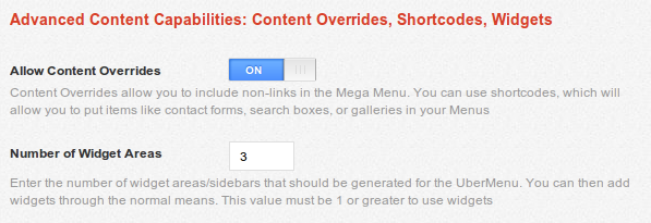
- Navigate to Appearance > Widgets and add widgets to the UberMenu Widget Areas
- Navigate to Appearance > Menus and expand a Menu Item (create it first if you haven't already), preferably a second-level item (though third-level+ will also work. Note that to use widgets at the top level, you need to activate that via Appearance > UberMenu > Descriptions, Shortcodes, Widgets > Allow Top-Level Widgets)
- Click Show/Hide UberMenu Options
- In the Display a Widget Area select box, select the Widget Area to display in this Menu Item
- Save the Menu
- Now UberMenu will load the Widget Area into your Menu. You can update the Widgets in the future without needing to change the Menu again.
UberMenu Easy Integration
Using UberMenu with Themes that do not support WordPress 3 Custom MenusUberMenu works by applying filters to a WordPress 3 Custom Nav Menu. These menus are inserted into the page via your WordPress Theme. Normally, UberMenu automatically replaces your theme's WordPress 3 custom menu, when WordPress 3 custom menus are supported. If your theme does not already support custom menus, you can add support by turning on UberMenu Easy Integration and adding a line of PHP code. Note: you still need to be running WordPress 3.3 or above for this to work.
1. Activating WordPress 3 Custom Menu Support
- Navigate to Appearance > UberMenu
- Under Theme Integration, enable Easy Integration
- Click Save Settings

2. Placing the Menu
Now that the theme supports WP3 Menus, we'll need to actually insert the menu somewhere. Most likely, you'll want to replace
your theme's old menu, which is usually a call to wp_list_pages
or wp_page_menu, though it can vary depending on your
theme. Once you've removed the old menu and any surrounding <ul> tags, you'll want to insert the following PHP
code where the menu should be displayed. Usually this would be inserted in your theme's header.php file,
but again this may vary depending on your theme.
Code:
<?php uberMenu_easyIntegrate(); ?>
Note: The above menu call should not be located inside <ul> tags, even if your theme's default menu is
Note that if you have already applied uberMenu_easyIntegrate() via a filter or hook (following one of the theme integration guides, for example), you can skip this step.
You can also use the shortcode equivalent, [uberMenu_easyIntegrate] in text widgets, for example
3. Activating the UberMenu Theme Location
Completing the above two steps should successfully enable your theme to work with UberMenu, giving you an "UberMenu" theme location in your menus panel. Now just configure UberMenu as usual!
Specifically, you will need to set the menu in the UberMenu Theme Location

Then, you will need to activate the UberMenu location

Then set up your menu as usual
Vertical Menus
If you are using a Vertical menu, you will likely want to set the mega submenu width under Basic Configuration > Vertical Menu Sizing. Otherwise, your submenu's width will be limited by the width of the menu bar - which is naturally narrower in a vertical state.
To size each submenu individually, you'll need to write custom CSS for each submenu.
Installing Updates
Periodically, new versions of UberMenu will be released. These may include bug fixes or enhancements, and you may or may not wish to upgrade.
Installing updates is just involves replacing the old plugin files with the new ones. It's always a good idea to back everything up before you upgrade, especially if you have made any changes to UberMenu's files, as the upgrade will overwrite all files. UberMenu settings set through the control panel will all remain intact.
Backing Up
- It is always a good idea to back up your plugin before making any changes
- Open your FTP program and FTP into your site and navigate to the wp-content/plugins directory.
- Download the ubermenu folder and save it as a backup
- If you have edited any files, especially the custom.css file, backing this file up is crucial
Upgrading
- Download the new version of the plugin from CodeCanyon
- In your browser, log into the WordPress control panel.
- Navigate to Plugins
- Deactivate UberMenu (optional, but generally a good idea, especially if you are deleting the old version in step 6)
- Switch to your FTP program, FTP into your site and navigate to the wp-content/plugins directory.
- After backing up (especially custom.css if you are using one), delete UberMenu (the entire ubermenu folder). Strictly speaking, this is optional, but makes the upload process more straightforward. You can also overwrite the old files if you prefer.
- On your desktop, decompress the zip file you downloaded from CodeCanyon
- Open the unzipped folder, which will contain a new ubermenu directory
- FTP the new ubermenu folder into the wp-content/plugins directory on your server.
- If you saved an edited copy of your custom.css file as a custom preset, upload it to ubermenu/styles/ directory.
- Ensure that your permissions are set properly on the plugins/ubermenu directory. If your server can't read the files, you might run into errors. This can happen depending on how your FTP account is set up.
- Switch back to your browser and go back to the Plugins panel
- Reactivate UberMenu by clicking Activate
Note: If you are running a local server, just copy the files rather than FTPing
Upgrading from 1.1.x to 2.0
Please review the following notes on upgrading
- It is recommended to test on UberMenu 2.0 in a test environment and not on a live production site.
- Please back up your WordPress installation before installing so that you may revert easily if you do not like the changes.
- Both UberMenu Settings and individual menu item settings should be intact
- As the structural CSS has been modified, customizations may no longer appear as desired and may require modification
- If you have used the Style Generator, styles may no longer apply as desired. If you want to keep your old styles, you should make a copy of the CSS output, as they will not transfer - you can paste this CSS in the custom.css file if you wish to continue using this skin.
Installing the 2.0 update
- Backup your old UberMenu directory - to be safe, you should back up your entire WordPress installation, including database
- Deactivate UberMenu in the Plugins panel
- Delete the old UberMenu directory, wp-uber-menu. You will likely encounter errors if you try to install the new version without deleting this version first.
- Install UberMenu 2.0 as a normal WordPress plugin (the new directory is just 'ubermenu')
- Note that if you are using Timthumb and your images are not appearing, you may need to make the directory writable, even if you have done so previously.
New Admin Options
UberMenu adds new options in several places in your WordPress Admin area.
Activate UberMenu Locations
You'll notice a new Meta Options box in the Menus Control Panel. This panel determines whether a particular menu location will be megafied. The location of your menu must be activated in order to megafy the menu. This allows you to have certain one location megafied while others remain normal menus.
Please note that you can only have one Mega Menu per page. You could have 2 mega menus, but only if they never occur on the same page.
Menu Item Options
UberMenu integrates directly with the WordPress Menu System. It adds new options to the Menu Items you can add via Appearance > Menus. The function of each option is detailed in the hover-tooltip available to the right of each option in the Appearance > Menus screen.

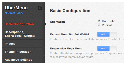
UberMenu Control Panel
The UberMenu Options Panel is the place to customize your UberMenu. It is accessible via your Control Panel, under Appearance > Uber Menu. With it you can:
- Configure settings like orientation, transition, trigger event, description display, image size, and more
- Set how you'd like to style your Menu
- Select Style Presets
- Create Custom Styles and generate CSS
- Preview your Menu
- and a lot more
Each option has a description which explains what it does right in the control panel for easy reference.

UberMenu Layout
Menu Bar Positioning
Added in version 2.0.1.0By default, the menu bar will fill the width of its container. Note that the menu bar cannot be any wider than its container.
Full Width vs Natural Width
If you'd like the menu bar to only be as wide as its top level items, you can disable the "Expand Menu Bar Full Width" option in Appearance > UberMenu > Basic Configuration.
Centering the menu bar
Sometimes when you replace your theme's menu with UberMenu, it'll take up the entire width of the window, rather than the content width. Centering to the content width is now simple and can be done in the UberMenu Control Panel

- Navigate to Appearance > UberMenu > Advanced Settings
- Set the Menu Bar Width to the width of your content. 960px is a common width.
- Enable Center Menu Bar.
- Enable Enable Clearfix if it is not already on
- Don't forget to disable the Expand Menu Bar Full Width option in Appearance > UberMenu > Basic Configuration.
- Save your settings
Your menu should now be centered.
Centering the inner menu bar
Sometimes, you want the menu bar to span the entire width of your window, but the menu items should be bound within the extents of the site content.

Note that to have the menu bar expand the full width of the window, its parent element must be the full width of the window. The menu bar cannot be wider than its wrapper.
- Navigate to Appearance > UberMenu
- In the Basic Configuration panel, activate Expand Menu Bar Full Width
- In the Advanced Settings panel, leave Menu Bar Width empty, and disable Center Menu Bar
- Enable Enable Clearfix
- Set the Inner Menu Width to the width of your site content. 960px is a common width
- Enable Center Inner Menu
Your menu items should now be centered to your content.
Centering the items themselves within the menu bar
If you want the menu items themselves to be centered (as opposed to their container), you can easily do this in the Control Panel > Advanced Settings > Center Menu Items
Position the menu bar to the right
If you want to position your menu bar to the right of the layout, you can add this CSS to float it to the right:
					#megaMenu{
						float:right;
					}
Also be sure to disable the Expand Menu Bar Full Width option in the UberMenu Control Panel. If the menu bar is full-width, floating it will not make it less than full width
Remember that your submenus can only be as wide as your top level menu bar by default. If you wish them to be wider, you can follow these instructions
Understanding how items translate into layouts
When you build a menu in the WordPress Menu system, you create a hierarchical tree structure, that is visually represented similar to a nested list
	Electronics  			//1. First level menu item
		Computers		//2. Second level menu item (submenu column header)
			Laptops		//3. Third level menu items
			Desktops
			Netbooks
			Accessories
		TVs			//2. Second level menu item (submenu column header)
			LCD		//3. Third level menu items
			Plasma
			DLP
			Projection
		Cell Phones		//2. Second level menu item (submenu column header)
			AT&T		//3. Third level menu items
			Verizon
			Sprint
			T-Mobile
		MP3 Players		//2. Second level menu item (submenu column header)
			iPod		//3. Third level menu items
			iPod Touch
			iPod Nano
			Sandisk

	Sports & Outdoors		//1. First level menu item
		Outdoor Activities	//2. Second level menu item (submenu column header)
			Hiking		//3. Third level menu items
			Skiing
			Snowboarding
		Team Sports		//2. Second level menu item (submenu column header)
			Soccer		//3. Third level menu items
			Football
			Basketball
			Hockey
			Baseball

	Clothing			//1. First level menu item
		Women's Clothing	//2. Second level menu item (submenu column header)
			Shirts		//3. Third level menu items
			Pants
			Skirts
			Dresses
		Men's Clothing		//2. Second level menu item (submenu column header)
			Shirts		//3. Third level menu items
			Pants
			Ties
UberMenu translates this hierarchy into a mega menu structure
| Electronics | Sports & Outdoors | Clothing | |
| Computers | TVs | Cell Phones | MP3 Players |
| Laptops | LCD | AT&T | iPod |
| Desktops | Plasma | Verizon | iPod Touch |
| Netbooks | DLP | Sprint | iPod Nano |
| Accessories | Projection | T-Mobile | Sandisk |
Top Level Menu Items
Laid out horizontally, left to right. Always visible.
For a horizontally-aligned menu, the top level menu items are listed in the row of main links in the navigation menu. For a vertically-aligned menu, these items are aligned in a column. The top level menu items are always visible.
Example of Top Level Menu Items: Electronics | Books | Sports & Outdoors | Clothing
Second Level Menu Items
Laid out horizontally, left to right. Submenu Column Headers.
The second level menu items (those that are indented once below top level menu items) are treated as headers within the sub menus. They contain third level menu items to for sub menu groups. These groups are aligned as columns within the sub menu, with the second level menu items as the headers at the top of each column.
Example of Second Level Menu Items, sub-menu of Electronics: Computers | TVs | Cell Phones | MP3 Players
Third Level Menu Items and Below
Laid out vertically, top to bottom. Listed below their second level item header.
All menu items deeper than level 3 are treated as level 3 menu items. These items are the content links within their parent categories. Sibling items are aligned vertically in list-fashion below their column headers (second level menu items).
Example of Third Level Menu Items, under Electronics > Computers: Laptops | Desktops | Netbooks | Accessories
Pure CSS
You can use UberMenu as a pure CSS menu. By default, all submenus will be the full width of the menu bar. You can control the number of columns in the menu item options. If you do not set a number of columns, each column will size to its natural width.
If you want to create a pure CSS menu with non-full-width submenus, you can customize the widths and positioning of the submenus via CSS. Here is how you target an individual submenu. The ID is specific to the top level menu item, which can be determined using Firebug or Chrome Developer Tools.
						/* Size and Position Submenus */
						#megaMenu ul #menu-item-48 > ul.sub-menu-1{
							left:100px;
							width:720px;
						}
						#megaMenu ul #menu-item-146 > ul.sub-menu-1{
							left:22px;
							width:920px;
						}
						#megaMenu ul #menu-item-108 > ul.sub-menu-1{
							left:330px;
							width:440px;
						}

jQuery Enhanced
Full Width Submenus
A full width submenu will be the same width as the top level menu bar. If you use a full-width submenu, you can set the number of columns. This will automatically align your menu item groups into equal-width columns. If you do not set the number of columns, the submenu items will be laid out by their natural widths.
Columns
Setting the number of columns per row will divide your submenu items into equal-width, percentage-based columns. New rows are automatically created when you have more second level menu items than columns. Normally, you would not need to use the "New Row" menu item option when using columns. However, it is still good practice to do so, and may be required if your columns are uneven heights.
A full-width submenu with 6 columns:

Natural Width Submenus
To understand column layouts, you need to understand the box model.
Second level menu items create a "box" around their sub items. The dimensions of this box are dictated by the content. Generally, this is the length of the longest line of text in a submenu item group (a second level menu item and its children).
These boxes are stacked from left to right within the submenu. They will continue to flow left to right until either:
- No more boxes can fit within the width of the submenu, the width of which is capped by the top level menu width.
OR - A second level menu item with a "New Row" flag is reached.
When using natural width submenus, you should always create your rows by clicking "New Row" rather than lettings the boxes wrap automatically. This ensures that everything works as smoothly as possible.
Note that there is no concept of "columns" - just multiple, independent rows of boxes. If you want those boxes to align to form columns visually, they need to have the same width. You can manually set the width of your columns with custom CSS. Generally, if you have enough submenu items to form two rows of columns, you'll want to use the Full Width strategy above and set the number of columns, which will naturally align everything.
Alignment
You can set how your natural width submenu is aligned: left, right, or center. To center your submenu, you'll need to have jQuery Enhancements enabled.
A Natural-width, centered sub menu:

Columns
- Natural Width - sized to the natural width of the content. Recommended for submenus whose columns fit on a single row. However, you can create a second row by using the "New Row" option on the second level menu items. Columns are not automatically aligned.
- Column Grid - set a specific number of equal-width columns. Only available with full-width submenus. Recommended for submenus that require multiple rows. Columns are automatically aligned.
Exceptions
Widget areas are always sized as the full width of the submenu. This is because the widgets within them form the columns, rather than the menu items.
Adding Content to Your UberMenu
To create an UberMenu, follow the Setup Instructions, and then add content to your Menu. Items are added via the normal WordPress 3 Menu Management mechanism. For more information, read this.
Normal Flyout Menus
Even in an UberMenu, you can still create a normal flyout menu. Just make sure that Activate Mega Menu is NOT checked on the top level menu item. Add items as usual. Note that if the top level item is not a Mega Menu, the Mega Menu options are non-applicable, except for disabling text and links, and Align to Right Edge.
Mega Menus - Normal Link Content
Adding normal link content to a Mega Menu is as simple as creating a flyout menu. Just make sure that Activate Mega Menu IS checked on the top level menu item. Second level items create column headers and third level items fill the content below those headers. See the Layout section for more information on how to create the layout you want.
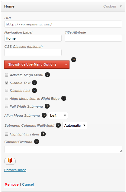
Mega Menus - Link Content with Images
UberMenu makes it easy to apply an image to each menu item, in any level. The image is placed to the left of the menu item text. Images can be automatically resized. You can control how this is done (via TimThumb or normal browser scaling) and to what size the images are scaled through the UberMenu Control Panel.
Here's how to apply an image to a Menu Item:
- Add a Menu Item
- Click Show/Hide UberMenu Options to display the advanced options.
- Click Set Thumbnail
- A popup dialogue appears.
- Upload or select the image through the normal WordPress Media Uploader
- Click Use as Featured Image this is critical
- Change any other settings, like title, etc, and click Save All Changes
- Close the popup
- You should now see a preview of your image in the Menu Item
- The image will automatically update without re-saving your menu.
Mega Menus - Link Content with Images - No Text
If you want to create image-only links (icons but no text), just check the Disable Text option on that menu item.
Note that you still need to set a Navigation Label, even though it won't be displayed. If you try to save the item with a blank Navigation Label, the item will be removed by the WordPress menu system.
Mega Menus - Link Content with Descriptions
Adding descriptions to your Menus is simple with UberMenu. Here's how to set them up:
- Activate the description levels you'd like to use in the Appearance > UberMenu > Descriptions,
Shortcodes, Widgets control panel. Turn on the levels you'd like to activate.

Note: this is done because descriptions are often set by default to the excerpt or full post text - if you only want to display descriptions on a particular level, this saves you from deleting all of the menu item descriptions on other levels.
- In the Appearance > Menus panel, click the Screen Options tab in the upper right
corner of the screen.

- In the Show advanced menu properties section, check the Description box.
- Now in every Menu Item box, there should be a text area labeled Description. Enter text to set
a description.

- Save your menu.
Adding Content Via Widgets
Adding content via widgets is easy, but takes several steps. The basic process is to (1) Create a Menu Item (2) Set the Menu Item's Widget Area (3) Populate the Widget Area with Widgets. You should think of a single menu item, which contains a single Widget Area, as a full-width row in the second level of the menu. Multiple widgets in a single widget area automatically create columns within that row.
- Set the number of Widget Areas you are going to use via the Control Panel
Appearance > UberMenu > Descriptions, Shortcodes, Widgets >
Number of Widget Areas. It must be set to at least 1 to use widgets.

- Save the UberMenu options with your new Number of Widget Areas.
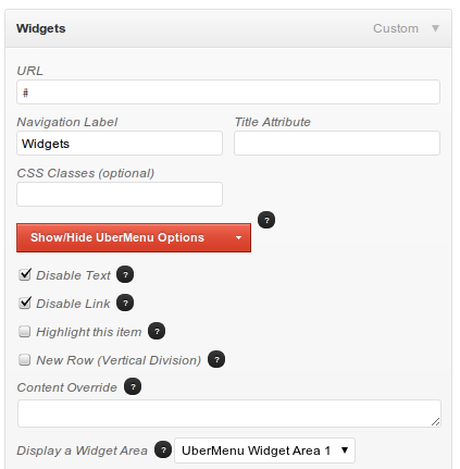
- Create a Menu Item (or edit an existing menu item) - second level menu items work the best
- Expand the UberMenu Options and select a Widget Area in the dropdown next to Display a Widget Area

- Save your Menu
- Navigate to Appearance > Widgets
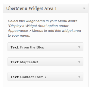
- Add Widgets to the Area that you selected in step 3, UberMenu Widget Area X
- Note that you may use shortcodes within text widgets.
- Save your widgets
Adding a Top-Level Widget
Note that by default, top-level widgets are deactivated. To activate top-level widgets:
- Navigate to Appearance > UberMenu
- Expand Descriptions, Shortcodes, Widgets and activate Allow Top-Level Widgets

- Save Options
Once you have top-level widgets activated, you'll be able to use widgets in top level menu items as described above.
Adding Custom Content, Including Shortcodes
Using content overrides, you can add any custom content to your menu you want, including shortcodes.
Adding content is easy, but formatting is sometimes unpredictable. You may need to apply custom CSS styles to your menu in order to make your shortcodes display the way you'd like them to - especially custom widths.
- In the Control Panel under Appearance > Uber Menu > Descriptions, Shortcodes, Widgets, turn
Allow Content Overrides on
- In Appearance > Menus, add an item to your menu
- Expand the UberMenu Options for the Item.
- Enter your custom content in the Content Override box.
- Save your menu.
- Apply custom styles if necessary
Included Shortcodes
UberMenu comes packaged with some useful shortcodes.
Columns shortcode
Basic link content gets columnized automatically, as does widgetized content. While this automatic column structure takes care of most use cases, sometimes you want more advanced column structures with uneven columns. The columns shortcode gives you this ability. Recommended usage is within a text widget.
For example, the following:
					[ubermenu-colgroup]

						[ubermenu-col]
							<h4>Column 1/4</h4>
							Lorem ipsum dolor sit amet, consectetur adipiscing elit. Nunc auctor
							dolor vitae felis accumsan.
						[/ubermenu-col]

						[ubermenu-col]
							<h4>Column 1/4</h4>
							Suspendisse ut purus nulla. Integer viverra diam sed augue pretium
							iaculis.
						[/ubermenu-col]

						[ubermenu-col colspan="2"]
							<h4>Column 1/2</h4>
							Curabitur in enim ipsum. Tel congue purus pharetra.  Nullam eget
							malesuada justo. Sed egestas, velit vel aliquet vestibulum, urna
							urna dapibus enim, non hendrerit lacus urna non justo.	Aliquam
							blandit magna eu enim auctor euismod.
						[/ubermenu-col]

					[/ubermenu-colgroup]
produces:
Column 1/4
Lorem ipsum dolor sit amet, consectetur adipiscing elit. Nunc auctor dolor vitae felis accumsan.Column 1/4
Suspendisse ut purus nulla. Integer viverra diam sed augue pretium iaculis.Column 1/2
Curabitur in enim ipsum. Tel congue purus pharetra. Nullam eget malesuada justo. Sed egestas, velit vel aliquet vestibulum, urna urna dapibus enim, non hendrerit lacus urna non justo. Aliquam blandit magna eu enim auctor euismod.
Add up to 7 columns, set your colspans, et voila!
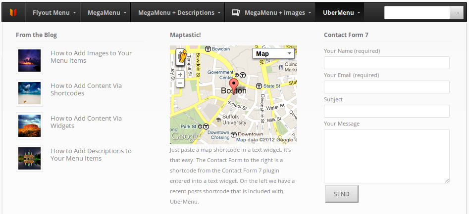
Maps
The UberMenu Google Maps shortcode allows you to insert geocoded map locations into your menu.
To use Google Maps you need to include the API, which can be done by enabling
Load Google Maps in Appearance > UberMenu > Descriptions, Shortcodes, Widgets

This map will automatically be recentered when the submenu is opened.
[ubermenu-map address="Boston, MA" zoom="15" title="My Title"]
Map shortcode parameters
| lat | The latitude of the coordinates to show on the map. This will load immediately. | 40.4166909 |
| lng | The longitude of the coordinates to show on the map. This will load immediately. | -3.7003454 |
| address | This address is optional and will be geocoded and displayed - it sends an extra request to do this, so if the geocode fails the original lat and long coordinates will be displayed. | 5 Calle de Sevilla, Madrid, Spain |
| zoom | The level to which the map should be zoomed to begin with. | 15 |
| title | The text to display when hovering over the map marker. | Agility, Inc |
| width | Width of the map. Defaults to 100%. | 200px |
| height | Height of the map. Defaults to 200px. | 200px |
Map in action:
Search Bar
[ubermenu-search]
- Activate Content Overrides in UberMenu > Descriptions, Shortcodes, Widgets > Allow Content Overrides
- Add a Custom menu item to your menu
- Set the Navigation Label to 'Search' and the URL to '#'
- Check Disable Text
- Check Disable Link
- Check Align Menu Item to Right Edget (optional)
- Add the shortcode to the Content Override textarea

Please note that this is a customization, not a supported feature of UberMenu. This section is intended to point you in the right direction with your customization, but any changes are your responsibility.
Inside the ubermenu.shortcodes.php file, you will find the definition of the ubermenu-search shortcode. If you'd like to make your own version, so that you may customize the HTML, just copy the definition to your theme's functions.php file, rename the shortcode and function name to create your own shortcode:
						function custom_searchform(){
$form = '';
return $form;
}
add_shortcode( 'custom-search', 'custom_searchform' );
You can then customize your search bar with CSS using this selector:
					#megaMenu > ul.megaMenu > li.menu-item > .wpmega-nonlink > form#searchform input[type="text"]{
						/* Your styles here */
					}
Enjoy!
Blog Post List
The recent posts shortcode allows you to show a number of recent posts and supports featured images.
[wpmega-recent-posts num="3" img="on" excerpt="on" category="cat_slug"]Recent Posts Shortcode Attributes
| num | Sets the number of posts to display. |
| img | Turn featured image display on or off. |
| excerpt | Turn the post excerpt on or off. |
| category | Set the category from which to pull posts. Use the category slug or ID. |
Contact Form
Contact forms can be added using Contact Form 7. Just paste the shortcode provided into either a Content Override box or a Text Widget
Contact Form Text Widget

Result:
Adding Horizontal Rules
To add a horizontal rule to your menu, enter the special character sequence --divide--
into the Navigation Label of a Menu Item. This Menu Item may contain widgets or shortcodes, or it may be left
blank. To start a new row with the horizontal rule, check the Vertical Division box.
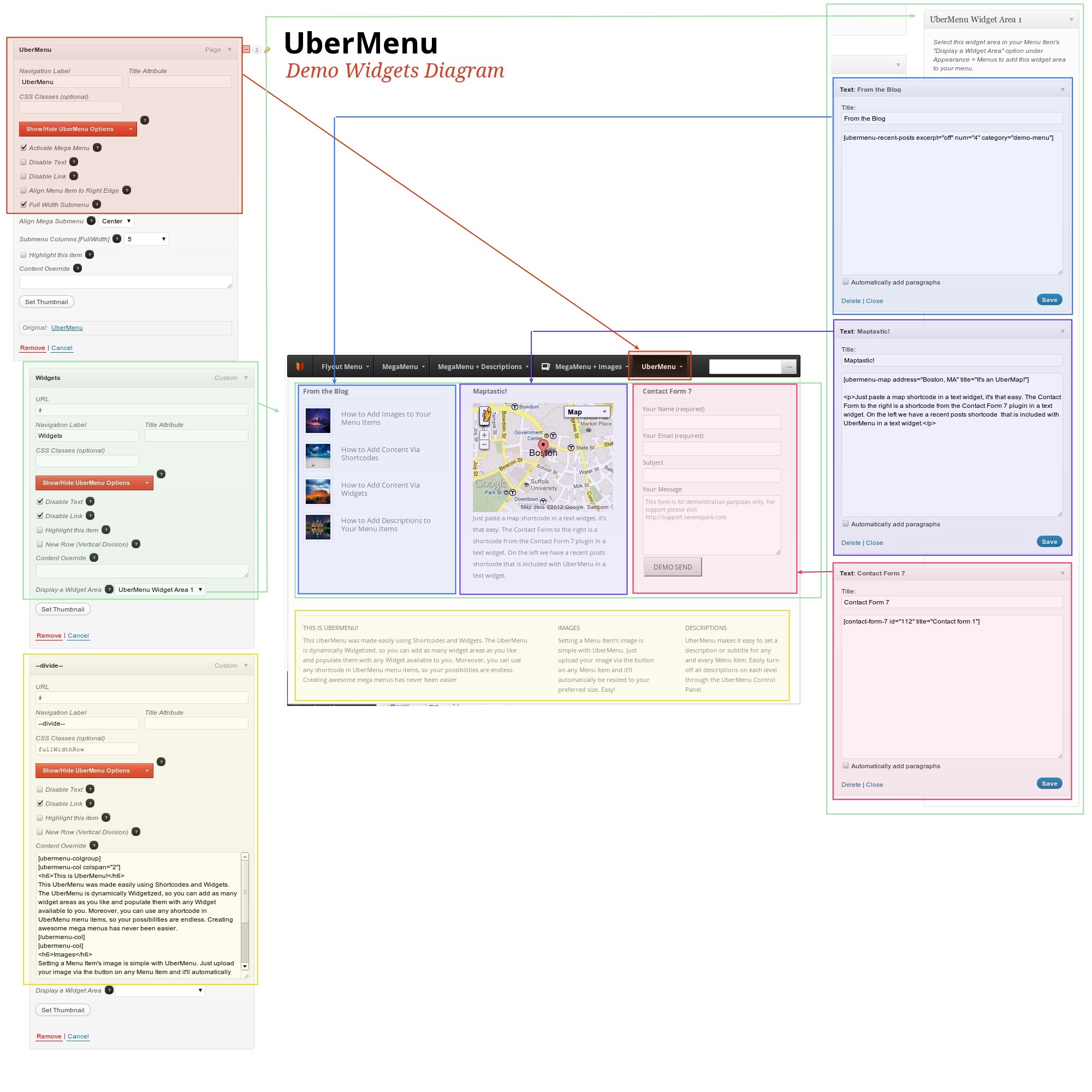
Recreating the UberMenu Tab/Dropdown from the Demo
Here's a visual map of how the UberMenu submenu is laid out (click to enlarge)
UberMenu and Mobile Devices
The first thing you need to understand about touch devices (smart phones and tablets), is that there is no true "hover" event, as there is with pointer (mouse-based) devices. A gesture (tap) on the screen must be translated into a hover or click event in the browser. The intent of the user is unknown, so the gesture is somewhat ambiguous. Since on menu items, hover and click have two distinct functionalities (open submenu versus follow link), the OS must use its "best judgment" to approximate click and hover events based on taps.
iOS (iPad, iPhone, iPod Touch)
iOS implements the following logic:
Scenario A: For menu items with a hover event (that is, menu items with a submenu)
- Tap #1 - display submenu. (Mimic Hover Event)
- Tap #2 - follow link. (Mimic click event)
Scenario B: For menu items without a hover event (no submenu)
- Tap #1 - follow link immediately
With the logic of Scenario A, it would not be possible to open submenus by tapping.
Hover-out (what the × is for)
Since iOS implements the "hover over" event as a tap on a menu item with a submenu, you'd expect it to implement the "hover out" event by tapping anywhere else; however, this is not the case. iOS only triggers the hover-out event when the hover-over event is triggered on a new element. That means that you can't just tap elsewhere to close the submenu.
The solution employed by UberMenu is to add a small × on iOS devices when the submenu is open, which allows the user to close the submenu by clicking it. Otherwise, the submenu would be effectively uncloseable.
Once the item has been clicked, however, the link becomes "primed". That means, the second time you click it, the link will be followed, rather than re-opening the submenu. Therefore, UberMenu provides a new button, ↓, in place of the ×, which allows the user to reopen the submenu by clicking the down arrow, or follow the link by clicking the link text.
Android
Android does things differently. The first tap immediately follows the link, even on menu items with dropdowns. To open a dropdown, it requires a swipe that starts on the menu item and ends off of it. This is best approximated by a downward swipe.
UberMenu implements a "Force Click Trigger on Android" option that makes Android behave more like iOS, which can be enabled or disabled in the control panel. The drawback is that to follow a top-level menu link, you need to hold, then choose "open link", rather than just tapping.
Hover-out
Android's hover-out event is triggered by clicking anywhere else on the page, so there is no need for the × button described above.
Customizing UberMenu
IMPORTANT
Any time you want to customize UberMenu's look and feel, you should use these techniques. NEVER edit the core files, or you will make upgrades very difficult for yourself.
UberMenu's skin system makes it easy to create your own styles, using either the Style Generator or a custom CSS file.
Style Generator
The Style Generator is the simplest way to create a custom skin for your menu.
- Open the UberMenu Control Panel, Appearance > UberMenu
- Open Style Configuration
- Set the Style Application to Style Generator

- Open Style Generator
- Set the colors and settings for each of the options

- Click Preview to see what your skin will look like. Refine if desired.

- When you are done, click Save All Settings
Including in the site <head>
By default, the custom styles generated by the Style Generator will be loaded in the site's <head>
Writing to a file
If you want, you can have UberMenu attempt to write a custom CSS file. In order to do so, you'll need
to have your stylegenerator/ directory writable by the server.
To write to a file, enable Save custom CSS to file
If the file cannot be saved, you will receive a warning when saving your settings. In this case, UberMenu will automatically revert to including your custom styles in the site head.
Including elsewhere
If you would rather include your custom CSS in another file, you can still use the Style Generator, but set the Style Application to Do Nothing. Then you can view the CSS (next to the preview button) and copy it into any stylesheet you want. No skin will be included by UberMenu in this case.
Custom Tweaks
Need to add just a few lines of CSS to tweak your menu? Just insert it in the textarea under Style Configuration > Custom CSS, and it'll automatically be added to your site <head>.
Fully Custom CSS
- Copy or rename
custom-sample.csstocustom.cssin thestyles/directory (just like withwp-config-sample.php). - In Appearance > UberMenu > Style Configuration, set Style Application to Custom
- Start editing custom.css as you see fit!
You should always back up this file before updating, just to be safe.
Using Firebug
Firebug tip!
It's tough to inspect a sub menu that is constantly retracting. Try switching your menu into click mode (UberMenu > Basic Configuration > Trigger). Then your submenus will stay expanded while you investigate them!
One great tool for customizing menu styles is the use of Firebug, a Firefox plugin. It allows you to inspect the HTML and the CSS styles, as well as change, add or remove styles temporarily to test changes. It's by far the best way to fully customize your menu style. You can get it at getfirebug.com. (Alternatively, you can use the built-in Chrome Developer Tools in Google Chrome by pressing F12).
Here are two a great videos on using Firebug. Just remember: DON'T EDIT THE CORE UBERMENU FILES. Instead, be sure to follow the UberMenu Customization Best Practices.
Using Firebug for CSS from kristarella on Vimeo.
Customization Assistant
The customization assistant will allow you to click on an item in a sample menu and see potential style selectors to customize that type of item. While I can't support individual customizations for each customer, I hope this will help you with your customizations!
Try the Customization Assistant →Javascript API
Events
ubermenuopen
Fires upon completion of a submenu show animation.
Example
					//See ubermenu.dev.js for full example
					var $li = $u( 'li.ss-nav-menu-item-depth-0' );
					var mapHandler = function(){
						google.maps.event.trigger(map, "resize");
						map.setCenter(latlng);
						//Only resize the first time we open
						$li.unbind( 'ubermenuopen', mapHandler );
					}
					$li.bind( 'ubermenuopen', mapHandler );
ubermenuclose
Fires upon completion of a submenu hide animation.
Functions
Pass the top level menu item ID selector (e.g. '#menu-item-15') to control the submenus.
uberMenu_openMega( id )
Opens a mega submenu
Example
						jQuery(document).ready( function($){

							//open the menu when clicking on a special button
							$('#my_special_button').click( function(){
								uberMenu_openMega('#menu-item-15');
							});

						});
uberMenu_openFlyout( id )
Opens a flyout menu
uberMenu_close( id )
Closes a submenu
Theme Integration
Most themes work with UberMenu out of the box. Some require a little tweaking.
Mingle / Salutation
Paralelus informs me that the same general solution works for Salutation as well, though it only has a single menu. Note that the line numbers below may differ somewhat.
Mingle and Salutation are awesome themes, but integrating them with UberMenu is a little tricky. Here are some guidelines for the changes you'll need to make:
1. First, Mingle/Salutation's menu javascript throws an error if the default menu doesn't exist. To solve this problem, we need to comment out the call to ddsmoothmenu()
for the left menu in the theme's footer.php around line 51
//if ($theHeader['menu_left']) { echo 'ddsmoothmenu.init({ mainmenuid: "MM", orientation: "h", classname: "slideMenu", contentsource: "markup" });'; }
2. To remove the theme's styling from the menu, you'll need to change the class name of the left/primary menu (.slideMenu) around line 50 of design-header.php
					//From:
					<?php if ($theHeader['menu_left']) { ?>
						<div id="MM" class="slideMenu">

					//To:
					<?php if ($theHeader['menu_left']) { ?>
						<div id="MM" class="uberslideMenu">
3. Now things are working as they should, you'll just need to restyle a bit (see Creating Your Own Styles - Via CSS). You'll likely want to reduce the padding on the top level menu items to make it fit, and maybe make the background of the menu bar transparent. Here is some code to get you started:
					#megaMenu{
					  ul.megaMenu > li > a {
					  padding:7px 10px;
					}
					#megaMenu ul.megaMenu{
					  background:none;
					  border:none;
					}
Remember, the width of the submenus is limited to the width of the top level nav bar, so if you want to increase it you can adjust the size like this:
					#megaMenu{
					  width:500px;
					}
4. Keep in mind that Mingle uses two menus, while UberMenu can only be used once per page. If you'd like to use UberMenu styles for "both" menus, I would recommend removing the second menu, using a single UberMenu, setting it to 100% width, and position some of the menu items to the right via CSS (the customization details are beyond the scope of this help file).
Genesis
As there are many Genesis child themes, this solution may vary among them. However, this technique is known to work with the default Genesis theme as of version 1.7. Similar strategies should work with alternate child themes, though specifics may vary with your child theme.
There are two issues when integrating with Genesis:
- The submenus may be hidden. This is due to an
overflow:hidden;on the#navdiv - The submenus will not be styled properly out of the box. This is due to residual styling.
Both issues are resolved easily by changing the ID of the #nav div or removing the container entirely. Of course, we don't want to edit the Genesis core directly, so we just use the Genesis filter system to update the menu display (add this code to your child theme's functions.php file):
					/* Child Theme's functions.php */
					add_filter( 'genesis_do_nav', 'genesis_child_nav', 10, 3 );
					function genesis_child_nav($nav_output, $nav, $args){
						return $nav;
					}
To accomplish the same thing with the submenu instead, you just need to change the filter:
					add_filter( 'genesis_do_subnav', 'genesis_child_nav', 10, 3 );
					function genesis_child_nav($nav_output, $nav, $args){
						return $nav;
					}
You may also need to center your menu afterwards, depending on your subtheme. You can do so either through the UberMenu Control Panel > Advanced Settings, or via custom CSS:
					#megaMenu{
						width:960px;
						max-width:100%;
						margin: 0 auto;
						float:none;
					}
That's it!
Jump Start by ThemeBlvd (Akita)
Jump Start is an excellent framework by Jason over at ThemeBlvd. The only compatibility issue with UberMenu is some residual styling from the theme framework. But since the theme framework is so flexible and you're likely already using a child theme, swapping out the menus is simple. Note that I developed these integration instructions specifically for Akita; but they should translate to all themes that use the Jump Start Framework. Also pay attention to the three options in the code which may be more appropriate for different themes.
(Place this in your child theme's functions.php):
					function replace_themeblvd_header_menu(){
						//Option 1: General Framework Menu Removal (this is already removed in Akita)
						//remove_action( 'themeblvd_header_menu', 'themeblvd_header_menu_default' );

						//Option 2: Theme- (Akita) specific menu removal (the menu that replaces the default in Akita out-of-the-box)
						//remove_action( 'themeblvd_header_menu', 'akita_header_menu' );

						//Option 3: Catch-all menu removal (just remove everthing - could have other impact)
						remove_all_actions( 'themeblvd_header_menu' );

						//Insert UberMenu
						add_action( 'themeblvd_header_menu' , 'uberMenu_easyIntegrate' );
					}
					add_action( 'after_setup_theme', 'replace_themeblvd_header_menu' );
Now just activate Easy Integration in the UberMenu Control Panel, set a menu for and enable the UberMenu Theme Location in Appearance > Menus, and you should be good to go!
If you get a layout issue (like the breadcrumbs are no longer visible), adding this code may help:
					#internal_wrapper{
					  clear:both;
					}
Karma
UberMenu integrates well with Karma except when it comes to templates with additional menus. If you use a template like Left Nav + Sidebar, you'll find that both the header nav menu and the sidebar nav menu become UberMenus.
The issue arises because Karma defines both menus as the same menu theme location. That is, both the menu in the header and the menu in the sidebar are defined as "Primary Navigation" by Karma. As a result, there is no distinction to be made between the two menus (they are really the same menu, printed twice), so you end up with two UberMenus.
					/* Karma/header.php line 76-80 */

					<?php if(has_nav_menu('Primary Navigation')): ?>
<?php endif; ?>
/* Reformatted here for visualization */
wp_nav_menu( array(
'container' =>false,
'theme_location' => 'Primary Navigation', //PROBLEM
'depth' => 0,
'walker' => new description_walker())
);
}
/****************************************************/
/* Sidebar - Karma/functions/global/subnav-left.php line 2*/
$menu_code = wp_nav_menu( array(
'container' =>false,
'theme_location' => 'Primary Navigation', //PROBLEM
'sort_column' => 'menu_order',
'menu_class' => '',
'echo' => false,
'before' => '',
'after' => '',
'link_before' => '',
'link_after' => '',
'depth' => 0,
'walker' => new sub_nav_walker())
);
The solution is to define a menu theme location for each real menu location within the templates (header, nav, etc). Really, we just want to make sure that the header menu is an UberMenu and nothing else. So the simplest solution is to use UberMenu Easy Integration for the header menu. This will automatically define a new theme location called "UberMenu". Switch it on in Appearance > UberMenu > Theme Integration > Easy Integration, then add the appropriate code:
					/* Replace the entire menu section call in header.php line 76-80 with uberMenu_easyIntegrate() */

					/* Remove this: */
					<?php if(has_nav_menu('Primary Navigation')): ?>
<?php endif; ?>
/* Add this: */
<?php uberMenu_easyIntegrate(); ?>
Once you've done that, just go to Appearance > Menus and set the appropriate menu for the UberMenu location, and activate that location (deactivate the others). You can set whatever menu you want for the Primary Navigation location, which will now be used for things like sidebars (you can use the same menu here, it'll just be printed normally rather than as an UberMenu.
So now,
- UberMenu (location) = header menu
- Primary Navigation = other menus
Headway 3.0+
Headway 3.0 makes things much easier than with Headway 2.x. The new system uses WordPress 3 menus properly, so that's great. However, since the Headway menu CSS is coded relative to the navigation block, rather than the wp_nav_menu container, we end up with residual styling which interferes with UberMenu. That means the easiest solution is to use UberMenu Easy Integration, and the Headway block system makes that possible without editing any core files. Here's what you need to do:
In a nutshell: we will replace the Headway navigation block entirely with a custom code block containing UberMenu Easy Integation.
- Activate UberMenu Easy Integration via Appearance > UberMenu > Theme Integration > Easy Integration
- Activate Strict Mode via Appearance > UberMenu > Theme Integration > Strict Mode
- In Appearance > Menus, Activate the UberMenu Theme Location by checking the Uber Menu checkbox in the Activate Uber Menu Locations meta box and clicking Save
- Set your desired menu in the "UberMenu" menu theme location in the Theme Locations meta box and click Save
- In the Headway visual editor, add a custom code block to the layout (not a navigation block). Set the easy integration code in the block like this:
<?php uberMenu_easyIntegrate(); ?>
- The submenus are hidden at this point in the process, because there is an
overflow:hidden;on the block applied by Headway. So we need to add this code to override that:/* Replace 11 with the ID of your custom block */ #block-11{ overflow:visible; }Whereblock-11is the ID of the custom block. You can place the style in Headway's Live CSS Editor. - That's it!
Headway, UberMenu, and IE8
Update: it has been reported that thelatest version of Headway addresses this issue, so it is no longer a problem - thanks, Headway! :)
I leave this explanation here for users of older versions of Headway
Headway includes an "IE Fix" script for IE8, which disables UberMenu's dropdowns. There's nothing UberMenu can do about this. However, Headway has identified a solution, and I've been told they intend to replace the fix script with the defacto standard HTML5 shiv. This will fix the issue.
Headway's response
I’ve been looking into this and have came up with a solution for the next update.

In the meantime, you can try inserting this PHP into your child theme functions.php file.

If you don’t have a child theme setup, you can use this plugin: http://wordpress.org/extend/plugins/one-click-child-theme/
						add_action('wp_head', 'add_html5_shiv');

						function add_html5_shiv() {
    						echo '';
						}
						add_filter('headway_standards_compliance_js', 'replace_ie9js_with_ie8js');
						function replace_ie9js_with_ie8js() {
						    return '';
						}
Link to Headway's response
Thanks to Headway for making their product more compatible!
How to integrate UberMenu with Headway theme (prior to Headway 2.0.11)
Note: if you're only using one menu on your site, UberMenu should work without the need for these steps
Headway does not implement WP3 Menus using Theme Locations, so it won't work with UberMenu out of the box if you want to use multiple menus on your site (it doesn't pass the compatibility test). To get UberMenu integrated with Headway without changing any core Headway code, follow these steps:
- Activate UberMenu Easy Integration via Appearance > UberMenu > Theme Integration > Easy Integration
- Activate Strict Mode via Appearance > UberMenu > Theme Integration > Strict Mode
- Select your desired menu under UberMenu in the Theme Locations meta box on the Appearance > Menus page.
This is the trickiest step, because Headaway actually hides the Theme Locations box. So we need to unhide it by either:- Using Firebug or Chrome Developer Tools.
Locate and select the#nav-menu-theme-locationsdiv, (below the Activate UberMenu Locations meta box). Disable thedisplay:none;, which will make the Theme Locations box appear.

- Editing the CSS
Open your theme'slibrary/admin/css/admin-global.cssfile and remove line 12:div#nav-menu-theme-locations { display: none; }
- Using Firebug or Chrome Developer Tools.
- Activate the UberMenu Theme Location by checking the Uber Menu checkbox in the Activate Uber Menu Locations meta box and clicking Save
- Hide the default Headway menu by clicking the checkbox in the Navigation box of the visual editor.

- Add the uberMenu_easyIntegrate() code to an Easy Hook in Header > After Tagline

- You may want to align your menu to the right
UberMenu should now be properly integrated with Headway
Redux by Orman Clark
Redux is great, it just requires some residual styling removal
- Open the theme's header.php. Locate this line:
<!-- BEGIN #primary-nav --> - In the line below, change the ID of the
#primary-navdiv touber-nav, so you have this:<div id="uber-nav">
- This removes the residual styling.
- By default, the menu will be full width and sit below the site title. If you would like the menu to appear in the original
theme menu's location, add this code:
						#uber-nav {
							margin-bottom: 40px;
							float: right;
							margin-right: -10px;
						}
iThemes Builder
- Activate Strict Mode in Appearance > UberMenu > Theme Integration
- Activate UberMenu Easy Integration in Appearance > UberMenu > Theme Integration
- Add a new HTML module in Builder, placing it where you want your menu to appear.
- Enter the Easy Integration shortcode in your module:
[uberMenu_easyIntegrate]
- Save the HTML module
- Builder tends to wrap code in containers that set overflow:hidden. If your submenus are hidden once you set up your menu, you’ll need to apply overflow:visible !important to the container. For example:
								#builder-module-#########,
								#builder-container-########## div.builder-module-outer-wrapper,			/* either this */
								#builder-container-########## div.builder-module-block-outer-wrapper{	/* or this */
								  	overflow:visible !important;
								}
where ######### is the ID of your module/container. The first selector may only be necessary if you're using a navigation module rather than an HTML module.
TIP
The easiest way to determine the ID is to use Firebug or Chrome Developer tools to inspect the menu, find its wrapper module, and grab the ID.
Your other option is to set #megaMenu{ position:absolute; } and then set an explicit height on the container instead of changing the overflow:hidden;
Xtreme One
Xtreme One does not support WordPress Navigation Menu Theme Locations, so it can't work with UberMenu out of the box. However, it implements a nice hook system, so we can easily remove the default nav system and replace it with UberMenu Easy Integration
- Add this to the blank child theme's functions.php:
function um_override_xtreme_setup_theme_nav() { $pri_nav = _xtreme_primary_nav_position(); remove_action($pri_nav['hook'], '_xtreme_primary_navigation', $pri_nav['priority']); add_action($pri_nav['hook'], 'uberMenu_easyIntegrate', $pri_nav['priority']); } add_action('xtreme_setup_theme', 'um_override_xtreme_setup_theme_nav', 50); - Activate UberMenu Easy Integration via Appearance > UberMenu > Theme Integration > Easy Integration
- Activate Strict Mode via Appearance > UberMenu > Theme Integration > Strict Mode
- In Appearance > Menus, Activate the UberMenu Theme Location by checking the Uber Menu checkbox in the Activate Uber Menu Locations meta box and clicking Save
- Set your desired menu in the "UberMenu" menu theme location in the Theme Locations meta box and click Save
Gantry Framework
First, Gantry doesn't use wp_nav_menu() as is the WordPress standard, so you'll need to use UberMenu Easy Integration. The easiest solution is to place a text widget in the menu widget area and set the widget's content to [uberMenu_easyIntegrate]. Don't forget to follow the remainder of the UberMenu Easy Integration steps.
Second, Gantry's custom menu item options override UberMenu's. To fix this, you'll need to edit wp-uber-menu-admin.php line 29:
add_filter( 'wp_edit_nav_menu_walker', 'wpmega_walker_edit' , 500);
Change the 500 to 2000, and the UberMenu options will appear.
Third, Gantry seems to have a bug regarding widget areas, so if you place a widget in UberMenu, you'll get an error. To solve this, add a check to the Gantry function to ignore widgets without their custom widget_map parameter:
if( !isset( $params[0]['widget_map'] )) return $params;
This would be placed in plugins/gantry/core/renderers/gantrywidgetsrenderer.class.php, around line 148, as the first line in the filterWidget() function. I have detailed this issue here, and I hope it will be resolved by Gantry in their next version.
Suffusion
New solution (as of October 2012)
Suffusion has added a new filter, making this process much easier
In your functions.php file, add:
					function nav_uber(){
    					uberMenu_easyIntegrate();
    					return false;
					}
					add_filter( 'suffusion_can_display_top_navigation', 'nav_uber' );
Then follow the guide for activating Easy Integration, and you should be all set!
Old solution (2011-summer 2012)
- Create a child theme and activate it.
- Create the file
custom/navigation-menu-main.phpin the child theme. Here's an example child theme, including this file. The content is simply:<?php uberMenu_easyIntegrate(); ?>
- Activate UberMenu Easy Integration and configure it
- At this point, UberMenu is included on the page, however there is major residual styling from Suffusion, which breaks the menu. To resolve this, you can either:
- Delete all the menu-related styles from Suffusion's stylesheets (based on
#nav), OR - Change the ID of the
#navdiv, which wraps the menu. It can be found insuffusion/functions/actions.phpline 282 in the functionsuffusion_display_main_navigation(). Change it toum_nav, for example.
- Delete all the menu-related styles from Suffusion's stylesheets (based on
A suggestion for the Suffusion developer: if using the standard WordPresswp_nav_menufunction isn't an option, I would recommend attaching thesuffusion_display_main_navigation()call to an action, rather than calling it directly. If that were the case, all we'd need to do would be to add aremove_action()call to the functions.php to remove the old nav menu, then anadd_action()to include the UberMenu Easy Integration. Alternatively, just make thesuffusion_display_main_navigation()function pluggable, so that it could be overwritten in the child theme. This would make the theme more extensible and easier to integrate with other plugins, especially when non-standard WordPress functions are used.
Striking
Striking integrates with UberMenu very well, but because the header elements of striking are all positioned absolutely, you'll need to position UberMenu absolutely with custom CSS as well.
					#megaMenu{
					  position: absolute;
					  right: 0;
					  bottom: 0;
					  width: 650px; /* Optional */
					}
Also see this excellent tutorial: How to get Übermenu full width in striking
GeoTheme
The problem with the current version of GeoTheme is that it calls the wp_nav_menu function twice, only printing it the second time, and UberMenu will only be applied to the first.
Basically, GeoTheme is trying to check for the existence of the menu before printing it, like this:
					if( wp_nav_menu( array( 'theme_location' => 'main_menu','fallback_cb' =>false,'echo' =>false) ){
   						wp_nav_menu( array( 'theme_location' => 'main_menu', 'fallback_cb' => 'nav_nav', 'echo' => true, 'container' => 'div', 'container_id' => 'main_nav_menu' ) );
  						...
					}else{ ?>
It generates the code for the menu, checks that something was returned, then generates the code for the menu a second time. Because UberMenu is only applied to the wp_nav_menu function the first time it is called (which was not actually printed to the site), no UberMenu is displayed - even though it was properly processed by the plugin.
At the very least, the first output should simply be captured in a variable and then printed (so that all the work of creating the menu markup doesn't have to be executed twice). Alternatively, the standard WordPress function has_nav_menu can be used to do the check without doing all of the processing.
The solution
We need to only call wp_nav_menu once with this theme location. In your header.php, either replace the wp_nav_menu() call within the if statement with has_nav_menu(), like this:
Make sure you edit the wp_nav_menu call with the main_menu theme_location.
					if( has_nav_menu( 'main_menu' ) ){
   						wp_nav_menu( array( 'theme_location' => 'main_menu', 'fallback_cb' => 'nav_nav', 'echo' => true, 'container' => 'div', 'container_id' => 'main_nav_menu' ) );
  						...
					}else{ ?>
Or, just replace the entire if/else statement with:
wp_nav_menu( array( 'theme_location' => 'main_menu' ) );
Alternatively
If you can't edit this for some reason, your other option is to remove the double menu check from UberMenu (ubermenu.php line 380 or so, comment out:
if( $this->count > 0 ) return $args;
However, this solution is not recommended as it does not address the root cause of the problem, the duplication of the menu call
Ultimatum
Ultimatum provides lots of flexibility, but its Ultimatum Menu Element does not seem to implement WordPress Menu Theme Locations, and therefore it does not meet the UberMenu requirements.
To integrate UberMenu, instead of using an Ultimatum Menu Element in your Header Layout, add a PHP Code Element instead.
In the body of the PHP Code Element, add the UberMenu Easy Integration Code
<?php uberMenu_easyIntegrate(); ?>
Don't forget to follow the remainder of the Easy Integration Steps, including setting a menu for the UberMenu theme location and activating it.

Thesis
Thesis 2.0 doesn't support theme locations, so we'll need to install a custom Box in order to use UberMenu
Watch the video Tutorial →Libra by Sara_p
UberMenu integrates easily with Libra, but there is some significant residual styling because the menu styles are based on the #nav ID, which is not set via wp_nav_menu. All we need to do is change the id="nav" to id="nav-uber", but since the menu is not printed directly in the header.php, we can't use the normal WordPress template system to just override the header template. Instead, we can use Libra's template system to provide our own replacement nav template. Here's what needs to be done:
- Create a child theme for Libra
- Create our own topbar.php template which will replace the default Libra template. This template will contain a single modification - change id="nav" to id="nav-uber"
- Override the pluggable yit_topbar() function so we can replace the template with our own. Add this code to the child theme's functions.php:
function yit_topbar() { require_once( 'topbar.php' ); } - Activate the child theme and set a menu in the theme location in Appearance > Menus
I've created a child theme that does all of this for you. Just install and activate it, then set up your menu as usual.
Download the Libra Child ThemeAvada
Version 2.1+In Avada 2.1 there are 5 different headers, so there are multiple locations you may need to edit in wp-content/themes/Avada/framework/headers to replace
with
Please see ThemeFusion's guide for more information
Prior to version 2.1Avada has its own responsive menu system, so you'll want to replace it with UberMenu. In the header.php file, you should find something like this:
Just remove the nav wrapper from around the wp_nav_menu call, then float the menu right
<?php wp_nav_menu(array('theme_location' => 'main_navigation', 'depth' => 4, 'container' => false, 'menu_id' => 'nav')); ?>
(the arguments don't matter apart from theme_location)
						#megaMenu{
							float:right;
							margin: 20px 0;
						}
That should neutralize the residual styling and Avada menu system
CSS Files and Structure
basic.css
Do Not Edit this file
This is an UberMenu Core file. Keep all your customizations in other files so that if there is a future UberMenu release you can just overwrite this file easily.
Contains the mega menu skeleton structure.
styles/skins/{skinname}.css
Do Not Edit these files
These are UberMenu Core files. If you want to edit a skin, copy it to the custom.css file so that if there is a future UberMenu release you can just overwrite this file easily.
Contains the styles for each skin. One of these is included when you set a skin preset.
custom.css & custom-sample.css
Make your customizations here!
Copy custom-sample.css to custom.css, then start customizing. custom.css is included when the Style Application is set to "Custom".
JavaScript
ubermenu.min.js
This is the main UberMenu functionality for the site. It is loaded when 'jQuery Enhancements' is enabled. It is minified.
ubermenu.dev.js
This is the non-minified, development version of ubermenu.min.js.
ubermenu.admin.js
This controls UberMenu backend functionality.
hoverIntent.js
Loaded when you set the trigger to "Hover Intent".
colorpicker.js
Loaded in the UberMenu control panel to create color pickers.
demo.js
Used for demo purposes only.
Frequently Asked Questions
My Submenus are not being sized properly
This generally indicates that you have a javascript error that is preventing UberMenu from running its script. To troubleshoot this, install Firebug or use Chrome Developer tools (F12 in Chrome) and load the page with Firebug activated. Look at the console for any javascript errors. Here is an example:

The errors above are unrelated to UberMenu, but prevent it from working properly. Most often, these types of errors result from poorly coded Plugins or Themes. They need to be resolved.
How can I change the height of my menu bar?
You can change the height of the menu using CSS. Depending on the effect you are trying to achieve, you may want to:
Increase the size of the top level menu itemsThis solution is recommended for most users
						#megaMenu ul.megaMenu > li.menu-item > a{
						  	padding-top:20px;
						  	padding-bottom:20px;
						}
Increase the height of the menu bar
						#megaMenu ul.megaMenu{
						  	height:50px;
						}
Increase the padding of the menu bar
						#megaMenu ul.megaMenu{
						  	padding:20px 0px;
						}
How can I create a menu item that does not link to another page?
You can create "dummy" menu items by using the hash tag. Just create a custom menu item and set
the URL to #. Then check Disable Link in the UberMenu Item Options.

The Menu Styles are messed up and don't look like the demo
This means that your theme's menu styles are affecting UberMenu adversely. Use Firebug to determine
how the theme styles the menu. Usually, the easiest fix is to change the ID or class of the containing
div (the one surrounding #megaMenu). Otherwise, you can delete the menu styles from your
theme. A third option is to counteract the styles using custom CSS.
For detailed instructions, please see remove residual styling.
My sub menus are being hidden behind other content. How can I fix this?
This is usually a z-index issue with your theme's container divs. There is a simple fix, but it must be applied to the appropriate containers. Specifically, the adjacent containers of the overlapping elements. For example, in this situation:
						<div id="wrap">
						  <div id="nav-container">
						    <div id="megaMenu">
						      ...
						    </div>
						  </div>
						  <div id="content">
						    <div id="overlapping-element"></div>
						  </div>
						</div>
You would need to apply these CSS styles:
						#nav-container{
						  position:relative;
						  z-index:20;
						}
						#content{
						  position:relative;
						  z-index:10;
						}
Put another way, the styles need to be applied to the relevant children of the first common ancestor of
the target (overlapping) elements. Above, the first common ancestor is #wrap, and its
children are #nav-container and #content. Sometimes, the adjacent containers
can be several levels up the DOM tree, so it is not necessarily the parent items that need to be positioned.
Why don't I have any UberMenu Widget Areas available?
To keep your control panel as tidy as possible, UberMenu Widget Areas are not enabled by default. To enable them, navigate to Appearance > UberMenu and enter an integer greater than zero in the Number of Widget Areas box. Save the options and you will see UberMenu Widget Areas appear in the Widgets control panel.
I switched themes and UberMenu stopped working. What happened?
Each theme registers different theme locations in which to place the menu. If your new theme still supports WordPress 3 Custom Menus, all you'll need to do is go back to Appearance > Menus, set your menu to the new Theme Location and activate that location with UberMenu. If your new theme does not support WP3 Menus, you'll need to use easy integration.
How can I use a Vertical UberMenu in a sidebar?
Please note that this FAQ is here to assist you as a reference guide, but it is considered a customization outside the realm of supported features.
By default, UberMenu flys out to the right, so we'll need to add some custom CSS to adjust that if we're using it in a right sidebar.
- Enable UberMenu Easy Integration in the UberMenu Options Panel
- Activate "UberMenu" in Activate Uber Menu Locations and set your desired menu under "UberMenu" in Theme Locations in Appearance > Menus.
- Add a new Text Widget to the sidebar of your choice.
- Set the content of the Text Widget to:
[uberMenu_easyIntegrate echo="false"] - The remaining steps are only necessary for right sidebars in order to reverse the flyout direction
- Add this CSS to either your custom.css file (if you are using the 'Custom' Preset) or to a
location where you store custom CSS
#megaMenu.megaMenuVertical ul .ss-nav-menu-reg ul.sub-menu, #megaMenu.megaMenuVertical ul .ss-nav-menu-mega ul.sub-menu-1{ left:auto !important; right:100% !important; } - Modify any other CSS you want, for example to remove or reverse the dropdown/flyout arrow indicators.
You may want to adjust the submenu styles, for example:
#megaMenu.megaMenuVertical ul.megaMenu > li.ss-nav-menu-mega > ul.sub-menu-1, #megaMenu.megaMenuVertical ul.megaMenu li.ss-nav-menu-reg > ul.sub-menu{ border-left:1px solid #ddd !important; border-right:none; box-shadow:-2px 2px #eee; } - Customize the menu as usual.
When I use the columns shortcode, I get a PHP Warning. What gives?
The columns shortcode uses regular expressions to intelligently determine your columns without the need to identify each column's index. This requires the use of the PHP pcre package, version 7.8 or later. The following error:
indicates that you are running an older version of pcre. To solve this error, upgrade your server's pcre package. You can contact your hosting provider for specific details.
Can I use UberMenu with WordPress MultiSite/WPMU?
UberMenu is only licensed for use on a single WP installation. If you want to use UberMenu on a WordPress MultiSite installation, you must purchase a license for each site.
That being said, UberMenu is not tested with WPMS, and the timthumb functionality of UberMenu may not work properly in WPMS installations.
UberMenu will not be able to be installed globally.
How can I highlight the current menu item?
UberMenu implements all of the standard current menu item classes, so you can target and adjust those properties via custom CSS . You can inspect the top level list items for each page using Firebug to see what is available to you at any given time. These are the standard options:
							.current-menu-item
							.current-menu-parent
							.current-menu-ancestor
To highlight the current menu item red, you could use this style, for example:
						#megaMenu > ul.megaMenu > li.ss-nav-menu-item-depth-0.current-menu-item > a{
						   color:red;
						}
Depending on where you put your code, you may need to employ the !important flag.
My menu works in all other browsers but isn't styled at all in Internet Explorer (IE). I hate that $%#! browser!
If your menu is showing up as an unstyled list, it's likely that you have HTML5 enabled. Internet Explorer can't handle HTML5 tags. You simply need to deactivate HTML5 via Appearance > UberMenu > Advanced Settings > HTML5
Otherwise, use make sure you don't have any plugin/theme javascript errors or residual styling affecting the menu
Where should I put my custom CSS?
You can put your CSS styles in any stylesheet that makes you happy. Your choice depends on an inherent trade-off in ease vs. maintainability.
Option 1: UberMenu'scustom.css
This is the recommended solution. Remember, custom.css is only loaded if you have the "Custom" preset selected in the UberMenu options. You'll need to copy your preferred preset styles into this file, and add your custom styles as well. See Creating your own styles via CSS for details. This is the best place from a maintenance perspective, because when you upgrade you'll just need to preserve the custom.css file.
Option 2: UberMenu's Style Configuration Custom CSS (Control Panel)New in UberMenu 2.0
If you have a small amount of CSS code to add, you can place it in your site head by adding it to Appearance > UberMenu > Style Configuration > Custom CSS
Option 3: A special place where you keep custom CSS.If you have created (or if your theme provides) a special location for custom CSS styles, this is a great place for custom UberMenu styles as well.
Note: Just keep in mind that this stylesheet is likely loaded before
UberMenu's, so if you're trying to override existing styles you'll need to either use more specific
selectors or use the !important flag in your styles.
style.css
You might already be putting your customizations in your theme's style.css. This is fine, just make sure you keep track of them. It's best to keep them all in one place so you can easily transfer them if you upgrade your theme. Also, see the above note regarding specificity.
Option 5: UberMenu's preset filesNOT RECOMMENDED
This is discouraged, because it will make it difficult to upgrade. If you want to edit or add to one of these files, copy it to custom.css first as described in Option 1.
Option 6: UberMenu'sbasic.css
NOT RECOMMENDED
This is a core file. It should never be edited unless you have no intention of ever upgrading UberMenu
Pick your poison! :)
UberMenu is unstyled on the login/registration page. How can I fix this?
Normally with WordPress, the login page isn't styled, so UberMenu's CSS and JS aren't loaded there in order to avoid conflicts that arise when only the login styles are loaded.
To load on the registration and login pages, just enable Load UberMenu on Login and Registration Pages in Appearnce > UberMenu > Theme Integration.
How can I have multiple headers in a column?
Normally, each row completely clears the previous row. So with this menu item hierarchy:
- Top Level
- One
- Red
- Blue
- Green
- Two
- Purple
- Orange
- Yellow
- Grey
- Black
- Three
- Dog
- Cat
- Bird
- Four
- Horse
- Cow
- Zebra
- Five
- Hospital
- Post Office
- Fire Station
- Six
- Bank
- School
- Gas Station
- One
Results in this layout:
| Top Level | ||
| One | Two | Three |
| Blue | Purple | Dog |
| Red | Orange | Cat |
| Green | Yellow | Bird |
| Grey | ||
| Black | ||
| Four | Five | Six |
| Horse | Hospital | Bank |
| Cow | Post Office | School |
| Zebra | Fire Station | Gas Station |
As you can see, the second row clears the first row entirely.
To create the following layout instead:
| Top Level | ||
| One | Two | Three |
| Blue | Purple | Dog |
| Red | Orange | Cat |
| Green | Yellow | Bird |
| Four | Grey | Six |
| Horse | Black | Bank |
| Cow | Five | School |
| Zebra | Hospital | Gas Station |
| Post Office | ||
| Fire Station |
You can use the Header Display menu item option, moving the flattening out the lower columns into third level menu items, and organize your items this way: (Display as Header Items in bold red)
- Top Level
- One
- Red
- Blue
- Green
- Four
- Horse
- Cow
- Zebra
- Two
- Purple
- Orange
- Yellow
- Grey
- Black
- Five
- Hospital
- Post Office
- Fire Station
- Three
- Dog
- Cat
- Bird
- Six
- Bank
- School
- Gas Station
- One
The menu item option looks like this (a third level menu item):
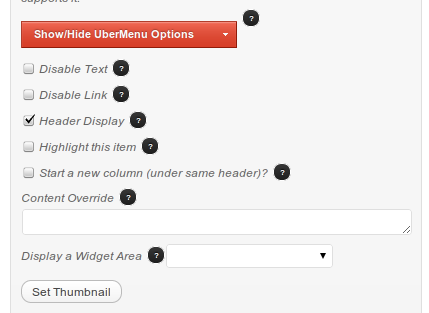
My submenu is hidden behind a Flash object
Flash objects are layered outside of the normal HTML layering system and do not adhere to z-indexing. They are always layered on top of all HTML. The way to fix this is to add a wmode parameter to the object and set the value to opaque or transparent. Here's an article describing wmode.
To the Object tag, add the following parameter (opaque is shown as an example):OR
To the Embed tag, add the following attribute:
wmode="opaque"OR
To a YouTube embedded video
add ?wmode=transparent to the embedded link like this:
						<iframe title="YouTube video player" width="480" height="390"
							src="http://www.youtube.com/embed/lzQgAR_J1PI?wmode=transparent"
							frameborder="0" wmode="opaque" >
See Fix YouTube embedded iFrame
iOS Video overlapping unresponsive menu issues
If your videos are dynamically created and inserted (with javascript, for instance), and they overlap an UberMenu submenu (or any content on your page) iOS won't handle that nicely - the overlapped content will become unresponsive after you activate/play the video.
Unfortunately, there is nothing to be done from an UberMenu standpoint - this is an issue with the way iOS handles dynamically inserted Flash objects and overlapping HTML elements. Here are some potential solutions for the issue - your mileage may vary:
Potential Solution #1
Getting embedded Youtube videos to stay under your drop down menu – even with an iPad – if you are using embed code, this may work - just like the wmode fix presented above.Potential Solution #2
This Stack Overflow answer explains the dynamic insertion issue (see the answer with 18+ votes) :
This solution has worked for some people, depending on the situation
You can fix z-index on dynamically created videos by giving the video element -webkit-transform-style: preserve-3d
Potential Solution #3
If your videos are dynamically inserted, insert them statically instead. The issue seems to only occur with dynamically inserted videos, based on reports.
Potential Solution #4
If all else fails, you could write some javascript that will hide the video when UberMenu is in the hover state. Something like:
But even this may introduce its own issues in iOS. Until iOS Safari becomes a more robust browser, this may simply be a limitation of having videos on your site
If none of the above solutions work for you, unfortunately this issue seems unresolvable for the time being. This issue is due to the way mobile Safari handles video elements and focus layering. Until Apple resolves the issue with mobile Safari, there is no solution to my knowledge.
I can only save X number of menu items.
Please note that this is not an UberMenu issue. It is a server configuration issue. Unfortunately, there is nothing UberMenu can change to fix the issue. You'll have to work out the solution to remove the POST vars limitation on your server or with your host. Hopefully this FAQ will point you in the right direction.
Some users will experience a limit to the number of items they can add to their menu. Unfortunately, this manifests as all menu items after the first X (X may be 16, 72, 270, or any number), and the rest will be lost.
This limit is NOT imposed by UberMenu. The limit is actually a server configuration issue. There are two common server configuration issues that can cause this problem:
1. Suhosin
Most commonly, this issue occurs due to a program called Suhosin which runs on your server. This is a known issue with WordPress, and affects both the standard WordPress Menu System, as well as UberMenu, which is built on top of that system.
In most cases, the solution is as simple as asking your host to increase the max_vars variables in your php.ini.
								suhosin.post.max_vars = 5000
								suhosin.request.max_vars = 5000
Here are some resources that should be useful for you:
2. max_input_vars
As of PHP 5.3.9, there is a new PHP ini directive called max_input_vars, which does the same thing as Suhosin's post.max_vars. By default, max_input_vars is set to 1000, which can easily be reached with the WordPress menu system (and you'll reach it even faster due to the extra options with UberMenu). The solution is to add the following to your php.ini:
max_input_vars = 5000;
(you might start by trying 3000)
Here is a bit more information
Note that it is inadvisable to have more than 100 menu items on a page for SEO reasons.
How can I change the font of the menu?
By default, the menu will inherit the font from your theme. You can change the font via custom CSS:
						#megaMenu, #megaMenu li, #megaMenu li a, #megaMenu li .widget, #megaMenu li p{
  							font-family: Helvetica, Arial, sans-serif;
						}
To change the font size, grab one of the selectors from the customizer and set the font-size property. For the top level:
/* Top Level Items */
#megaMenu ul.megaMenu > li > a,
#megaMenu ul.megaMenu > li > span.um-anchoremulator {
  font-size: 12px;
}
How can I change the widget area width?
Widget areas take up the entire width of a submenu by default. This is because the widgets inside the widget area form the columns, and a single menu item contains one widget area, which contains multiple widgets. This is explained in the Widgets section, and you can see a visualization in the Customization Assistant by clicking the "Uber" tab.
To adjust the width of the widget area, you can target it directly
							/* The ID will be specific to your menu */
							#megaMenu li#menu-item-9429{
							  width:173px !important;	/* whatever width you want */
							}
How to remove the arrow indicators
Arrow submenu indicators are added when one of two conditions are met:
- The Activate Mega Menu option is checked on a top level menu item.
- A flyout menu (Activate Mega Menu is unchecked) has child items
If you have top level menu items with no submenus and want to remove the arrows, simply uncheck Activate Mega Menu on those menu items
How to remove the indicators entirely
The arrow indicators are added using CSS :after pseudoclasses. To remove them add this CSS:
						#megaMenu ul li.ss-nav-menu-reg > li.megaReg-with-sub > a::after,
						#megaMenu ul li.mega-with-sub > a::after,
						#megaMenu ul li.ss-nav-menu-mega > a::after,
						#megaMenu ul li.ss-nav-menu-reg li.megaReg-with-sub > span.um-anchoremulator::after,
						#megaMenu ul li.mega-with-sub > span.um-anchoremulator::after,
						#megaMenu ul li.ss-nav-menu-mega > span.um-anchoremulator::after{
						  display:none;
						  border:none !important;
						}
You can then adjust the right-padding if you wish using these selectors: http://wpmegamenu.com/customizer/#top-level-a
How to remove the CSS3 transitions
UberMenu 2.0 includes some CSS3 transitions that make things smoother in modern browsers, for example the top level menu item tabs on hover. You'll notice these effects in Chrome and Firefox, but not older versions of IE. If you wish to remove these transitions, add this CSS:
							#megaMenu ul.megaMenu > li > a,
							#megaMenu ul.megaMenu > li > a:hover{
							  -webkit-transition:none !important;
							  -moz-transition:none !important;
							  -o-transition:none !important;
							  transition:none !important;
							}
Note that this is not the same as the submenu dropdown animation. You can turn that off in the UberMenu Control Panel if you wish.
There is no "Use as Featured Image" option
In WordPress 3.3, the way Featured Images were handled changed, making the "Use as featured image" option in the Media Manager "disappear". UberMenu 1.1.4 was released to make UberMenu compatible with the new WordPress release (please see the UberMenu change log at the bottom of the product page for more information).
If you are still using UberMenu 1.1.3 or earlier, and have upgraded to WordPress 3.3, you have two options: upgrade to UberMenu 2.0 (see the important upgrade instructions), which you can download through your CodeCanyon Downloads page, or you can contact me directly via my CodeCanyon contact form and I will send you a copy of UberMenu 1.1.4, if that's what you'd prefer.
Widgets are displaying on a new row
By default, widget areas create new, full-width rows, as described in the UberMenu Layouts section of the guide. This is for several reasons, the main being that the widgets in a widget area make up the columns, rather than individual menu items.
If you wish to have a widget area share a row with normal menu items, you'll need to make some CSS customizations to make them act like normal widget items. Essentially, this means floating the item left, adjusting its width, and removing the clear.
						#megaMenu li#menu-item-XX{
							float:left;
							clear:none;
							width:auto;
							padding:11px 27px;
						}
Where #menu-item-XX is the ID of your menu item to which the widget
area is attached.
Note that if you want to add more than one widget to this widget area, you may get unpredictable results (because the widget area is told to "size automatically", while the widgets are told to "size to the parent container". This is essentially a circular reference, and the result is unpredictable). Setting an explicit width (instead of 'auto') resolves the issue.
How to make a menu item link open in new window
This is actually a built-in WordPress feature.
- In the Appearance > Menus screen, click Screen Options in the upper right.
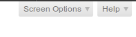
- Then, under Show advanced menu properties, check "Link Target"

-
Then check the "Open link in a new window/tab" option on your menu item
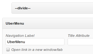
How to make the submenu wider than the menu bar
A common scenario is that the menu bar is aligned to the right of the header, and might only be 50% of the page width, however, you want the submenu to span the entire width of the content. By default, the submenu is restricted to the width of the top level menu bar, but this can be overridden.
For example, you may have UberMenu floated right:
							#megaMenu{
								float:right;
							}
Or it may be absolutely positioned:
							#megaMenu{
								position:absolute;
								right:0;
								top:20px;
							}
In these cases this might be the desired result:
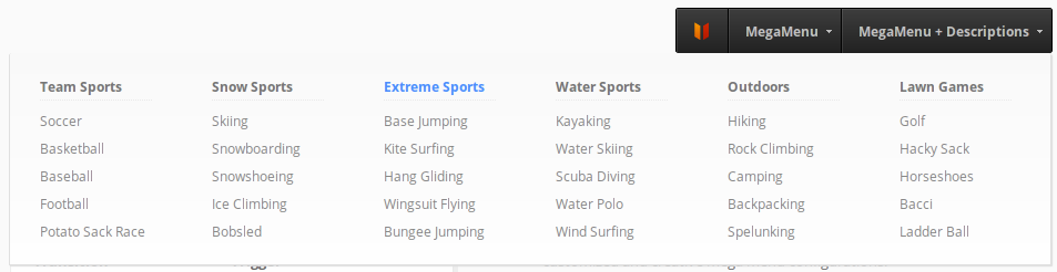
- For submenus that you'd like to expand, select Full Width Submenus on the top level menu item.
- Then, set the submenu alignment Right (optional, or set left depending on your situation).
- Next, add this code to expand the submenu beyond the width of the menu bar:
#megaMenu.megaMenuHorizontal ul.megaMenu > li.menu-item.ss-nav-menu-mega-fullWidth > ul.sub-menu.sub-menu-1{ width:940px !important; max-width:none !important; } - Alternatively, you can set the left or right values manually (rather than setting the alignment):
#megaMenu.megaMenuHorizontal ul.megaMenu > li.menu-item.ss-nav-menu-mega-fullWidth > ul.sub-menu.sub-menu-1{ width:940px !important; max-width:none !important; right:0; left:auto !important; } -
If your site is responsive, you will want to add some media queries to handle the submenu widths when your window is less than 940px, for example. One way to do this would be to wrap the above in a media query:
								@media only screen and (min-width: 960px){
									#megaMenu.megaMenuHorizontal ul.megaMenu > li.menu-item.ss-nav-menu-mega-fullWidth > ul.sub-menu.sub-menu-1{
									    width:940px !important;
								    	max-width:none !important;
									}
								}
Alternatively, you can add media queries for various sizes and adjust the width of the submenu manually. How you accomplish this is totally up to you and dependent on your site.
How to Style One or More Menu Items Differently
Please remember that customizations are not included in support. This FAQ is here to explain best practices, but you will need to implement the changes yourself
Styling an individual menu item
Just want to style a single menu item? Every item has an ID, and you can target that item by its ID. Just open up Firebug or Chrome Developer Tools and inspect the menu item in question. The ID is attached to the list item (LI). To style the menu item, use this selector template, replacing menu-item-100 with the ID of your menu item:
								#megaMenu ul.megaMenu li#menu-item-100 > a{
									/* place style properties here */
								}
Styling a group of menu items
Via highlighting
One easy way to accomplish styling a group of menu items is to use UberMenu's "Highlight" option for those menu items. You can customize the highlight style with this selector template:
							#megaMenu ul.megaMenu li.menu-item.ss-nav-menu-highlight > a,
							#megaMenu ul.megaMenu li.menu-item.ss-nav-menu-highlight > span.um-anchoremulator {

							}
Via Custom Classes
Want to pick and choose which menu items have your special styling? Add a class! This is a default WordPress menu feature. Just add your special class to each menu item you need styled differently, and style that CSS class however you like.
Here are details on Adding a custom class
Styling an entire level of menu items
Want to change the way an entire level of menu items looks, like the whole top level, or all submenu headers? You can get all the style selector templates you need by using the UberMenu Customization Assistant
How can I use the menu with only second level menu items?
UberMenu is designed to be used with 3 level of menu items. Second level menu items are headers, while third level menu items align vertically beneath those headers. Sometimes users have only the need for two levels. In that case, the vertical spacing of the second level menu items seems excessive, as there are no third level menu items to pad.
Adding this CSS to your custom styles will space the second level menu items more appropriately
							#megaMenu ul.megaMenu li.ss-nav-menu-mega ul.sub-menu-1{
							  padding-top:10px;
							  padding-bottom:10px;
							}
							#megaMenu ul.megaMenu li.ss-nav-menu-mega ul.sub-menu li.menu-item{
							  padding-top:0;
							  padding-bottom:0;
							}
							#megaMenu ul.megaMenu li.ss-nav-menu-mega ul.sub-menu li.menu-item > a{
							  border-bottom:none;
							  padding-bottom:0;
							  margin-bottom:0;
							}
My theme's responsive menu interacts strangely with UberMenu
Many responsive themes use the "responsive select menu" paradigm to display their responsive menus. This means that the theme actually prints two menus, and uses CSS media queries to only display one at a time.
By calling wp_nav_menu twice with the same theme_location parameter, the theme produces two menus, only one of which will become an UberMenu. The second is now superfluous.
Here's what the setup usually looks like:
Several situations may arise, depending on how the theme has setup its responsiveness:
- Both menus may be displayed at small sizes
- UberMenu may be hidden by the theme at small sizes
- UberMenu may be hidden at full size
You have three options to resolve this:
1. Using only UberMenu
UberMenu is already responsive, and does not require an additional menu. If you wish to use UberMenu's responsive capabilities, you'll need to find the secondary (responsive) wp_nav_menu call (normally in your theme's header.php), and remove it. Now you'll have a single menu controlled entirely by UberMenu. Be sure to remove any residual styling (see also: residual styling troubleshooting guide) in the process.
2. Using UberMenu with the theme's responsive menu
If you want to use UberMenu for wider screens and the theme's responsive menu for mobile devices, you'll need to do two things:
- If your responsive menu is printed first, and you aren't getting an UberMenu at all due to the wp_nav_menu function being called twice with the same theme_location parameter, replace the wide-screen wp_nav_menu call with UberMenu Easy Integration. This creates a separate theme_location (called "UberMenu"), which we will activate - and then deactivate the theme's standard theme_location.
- You'll then (likely) need to apply CSS to hide UberMenu ( #megaMenu{ display: none; } or .main-menu-standard{ display: none; } ) for the appropriate size/media query. This will vary based on your theme, so it's easiest to base it on the original menu's media queries (switch off UberMenu and observe the breakpoints using Firebug or Chrome Developer Tools.
3. Use UberMenu + Responsive Select Menu
You can also use UberMenu with my (free) Responsive Select Menu plugin. Again, you'd remove the second wp_nav_menu call, then just follow the instructions to set up the Responsive Select Menu at the appropriate breakpoint (no coding required, you can do this in the Responsive Select Menu Control Panel). See a demo here
Memory Limit
Some users may experience a memory limit error. This means that your WordPress installation (core + theme + plugins) have overrun the memory limit allowed by your server. The error looks like this:
Fatal error: Allowed memory size of XXXXXXX bytes exhausted (tried to allocate XXXXX bytes) in /path/to/function/file on line XXX
Tip: You can check your PHP configuration settings by viewing the output of the phpinfo() function
The solution is to increase the PHP memory limit on your server. There are several potential ways to do this:
1. php.ini
Your server has a PHP initialization file (php.ini). To increase your memory, you change the memory_limit directive. Usually 64MB or 128M is a good amount.
memory_limit = 64M
The error message will indicate how many bytes (translate this to MB using Google if needed) your current system has allocated, and you can use this as a basis for how much you increase your limit.
2. wp-config.php
WordPress offers a way to Increase memory allocated to PHP in your wp-config.php file.
3. Contact your host
Depending on your host, you may or may not have access to php.ini, and they may disallow the wp-config.php solution. In that case, you will need to contact them directly to resolve the issue. If they refuse to increase your memory limit, you'll either need to change your hosting plan or lighten your plugin/theme load to reduce the memory requirements of your installation.
Please note that this is not a problem with UberMenu - the available memory is shared among all plugins, theme, and WordPress core running in your installation. As the different parts of your installation load, they use up your server's capacity. The error simply occurs on the function that happens to send it over the limit. Often the function that puts it over the top is only a few kilobytes.
Debugging
If you run into a PHP error, for example, an Internal Server Error, you'll need to enable debugging on your WordPress site in order to identify the error in a meaningful way. To do so, edit your wp-config.php file as described here. Replace the part that normally sets WP_DEBUG to FALSE with
							/**
							 * This will log all errors notices and warnings to a file called debug.log in
							 * wp-content (if Apache does not have write permission, you may need to create
							 * the file first and set the appropriate permissions (i.e. use 666) )
							 */
							define('WP_DEBUG', true);
							define('WP_DEBUG_LOG', true);
							define('WP_DEBUG_DISPLAY', false);
							@ini_set('display_errors',0);
Now re-do whatever caused the error, and then check the debug.log file (again, don't forget to make sure the server can write to it!)
The debug log normally gives a pretty clear explanation of the issue. The most common issues will be resolved by configuring your server properly, normally by increasing the memory_limit or max_execution time.
Not a menu item
If you receive the message "the given object id is not that of a menu item", this seems to be an issue with the standard WordPress menu system. It seems that it is the result of some type of database corruption
There are two things you can do:
1. Try repairing your MySQL database.
A use has reported that working with the same issue here
2. Increase your PHP memory_limit, as suggested here
It is likely your server is hitting its configured memory limit and preventing the menu save from completing successfully, leaving you with a broken menu.
There is also the possibility that you have reached a Menu Item Limit, and that those solutions may help
Caching Plugins
Some users have reported issues with caching plugins such as W3TC (W3 Total Cache). The symptom is that the menu is intermittently displayed as an unstyled list on cached pages.
I've investigated this issue, and the cause is that the caching program has not properly cached the menu markup - instead, it seems to revert to either the theme's markup, or some default markup for the menu, thereby resulting in the unstyled list of menu items.
In other words, UberMenu is not being displayed at all. Codewise, UberMenu's display is a combination of two things: HTML and CSS. The CSS (stylesheets) are still loaded; however, the cached page does not display the UberMenu-generated HTML markup. As a result, there is nothing for the CSS to style (the elements which the CSS targets do not exist). The menu being displayed is not UberMenu at all, and that is the problem.
To my knowledge, there is nothing UberMenu can do to change how W3TC chooses to cache the page. UberMenu follows all of the WordPress standards to create the menu markup (via filters and custom navigation walkers).
Please note: I am not sure if this is an issue with the plugin itself, or with the way the plugin has been configured on a particular site.
For help with caching issues, I recommend contacting the author of the caching plugin, as they will certainly have better insight into how the caching works. If there are any recommendations that will help the caching plugin be more compatible, I am certainly willing to consider them.
Potential Solution
One potential solution is to use the caching plugin mfunc functionality. For example, in WP-Super Cache this may help (different plugins may use different syntax, check your caching plugin's documentation for details on "dynamic caching")
<?php wp_nav_menu( $args ); ?>
For now, if you experience this issue and the above does not help, the recommended solution is to disable caching.
Styling the Mobile Close (×) button
The black square that shows up on mobile devices allowing to close the menu on touchscreens can be styles with the selectors below. I recommend only changing colors/fonts.
						#megaMenu ul.megaMenu a span.uber-close,
						#megaMenu ul.megaMenu span.um-anchoremulator span.uber-close{
						    top:0;
						    right:0;
						    background:#999;
						    background:rgba( 0, 0, 0, .9 );
						    font-size:20px;
						    font-weight:bold;
						    color:#f5f5f5;
						}